



A foundation’s communications team is assembling its annual report, and the water-conservation chapter has no usable photograph. The field images are several years old, and nobody can confirm that the people in them agreed to appear again. A designer suggests generating an illustration instead. It looks fine, so it goes onto the chapter opener. Within a week the same picture sits in a donor deck and two social posts, and no one remembers whether it shows a real village or an invented one. An image added for decoration has started to be read as evidence, and CSR communication depends on evidence.
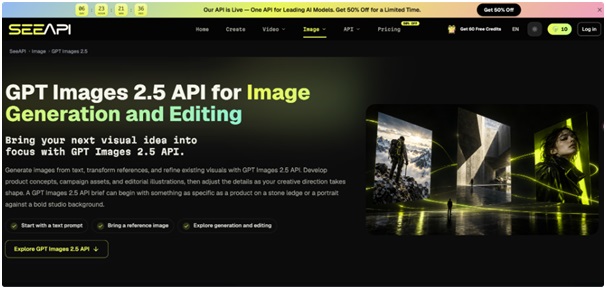
Blanket bans on synthetic images are impractical, because teams face real gaps in photography, consent and budget. A single instruction to “label everything” is not much better, since a label does not tell the reviewer what to inspect before publishing. A team needs a way to decide, image by image, what is acceptable, who approves it and what gets recorded. The sections below give a sorting rule, a brief that sets limits, a four-point review and a record that survives staff changes. For the drafting step, a text-and-reference route such as Image 2.5 API is one option to explore, provided the sorting and review happen around it rather than after it.
Separate Documentary Images from Illustrative Ones
Start with one question for every visual: is it offered as proof that something happened? A photograph of a handover ceremony, a before-and-after view of a restored pond or a portrait of a scholarship recipient is documentary. Readers treat it as a record, so it must come from the real event, with permission from the people shown. A generated image cannot occupy that slot, however convincing it looks.

Illustrative images carry an idea instead. A stylised scene of rainwater flowing into a recharge pit, an abstract cover for a sustainability report or a background for a quote card does not claim to depict a specific place or outcome. Sort every planned visual into one of the two groups before anyone opens a generation tool. If a visual sits between them, such as a “typical village” scene placed beside real beneficiary numbers, treat it as documentary and use a photograph, or change the layout so the image no longer sits next to a factual claim. The sorting sheet needs only three columns: where the image will appear, what it is meant to show, and which group it belongs to.
Write a Brief That Names What Must Not Appear
Once an image is classed as illustrative, the brief becomes the control document, and a vague brief is where trouble starts. A useful brief has four parts. State the placement and crop, such as a wide chapter opener with space on the left for a headline. State the subject concretely: an illustrated hand tilting a clay pot over a seedling, not “community empowerment”. State the visual style, which should match the organisation’s existing illustration so the image does not suggest a new voice. Then add an exclusion list.
The exclusion list does the protective work. For most CSR material it should rule out recognisable real people, identifiable landmarks or school buildings, legible signboards and logos, invented statistics rendered as text, and any scene that could be mistaken for a named project site. It should also name subjects where the team decides illustration is inappropriate altogether, such as children receiving treatment or families affected by a disaster. Writing these limits down before drafting stops reviewers from negotiating them after a design has already been admired.
Generate and Revise Drafts in Controlled Steps
Drafting should be small and comparable. Ask for three or four concepts built on the same brief, differing in composition or mood but not in subject, so reviewers compare ideas rather than unrelated pictures. Reject any draft that breaks the exclusion list at once instead of trying to repair it, because repairs tend to carry the original problem along.
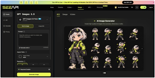
Revision is where a reference image earns its place. After the team approves one concept, for instance a flat illustration for the chapter opener, ChatGPT Images 2.5 API can take that approved picture as the reference alongside a written instruction. The useful inputs are the reference itself, a plain list of what must stay, such as the figure’s pose, the clay pot and the colour palette, and the single change wanted, such as a lighter background for the print edition. The service returns an edited version within that scope. Someone should then open it at its intended display size beside the approved version and confirm that the preserved elements survived, that no new objects or lettering appeared, and that the new background still leaves room for text.
Keep every iteration. Save the brief, the approved concept and the final edit in one folder, because the next reviewer will ask what changed and why.
Run Each Draft Through Four Review Checks
A draft that satisfies the brief still needs structured review, ideally by someone who did not write it. Four checks cover most of the risk.
- Check People and Places
Look at every face, uniform, building and landscape for resemblance to something real. Generated figures can resemble actual individuals by coincidence, and a scene with a recognisable temple, school gate or river bend can read as a claim about a specific location. If a reviewer can name a real person or place from the image, redraw it or drop it.
- Check Text and Figures
Zoom in on any lettering, numerals or signage. Garbled text is a sign the image should not appear in a report. Numbers inside images are worse, because a chart-like graphic with invented values will eventually be quoted. Remove text from the picture and set it in the layout instead, where it can be checked against source data.
- Check What the Image Implies
Place the image beside its caption and the paragraph around it, then ask what a reader would conclude. An illustration of smiling children beside a new water tank suggests a delivered outcome even when the text says the tank is planned. If the implication runs ahead of the evidence, change the caption, change the placement or replace the image.
- Confirm the Label and Approver
Decide the disclosure wording, for example “Illustration created with AI tools; not a photograph of the project site”, and place it where readers see the image rather than in a footnote. Record the name of the person who approved it. An image with no named approver should not leave the building.
Illustration Is Acceptable When Evidence Stays Separate
The decisions that matter most come early and late. Early, classify each visual as documentary or illustrative and keep generated images out of anything offered as proof. Late, review every draft against the exclusion list, then check people and places, text and figures, implication and label before anyone signs off. Between those points, a specific brief and controlled revisions keep drafts comparable, so reviewers judge a handful of options instead of an endless stream.
Over time, the records become the real asset. A folder holding the sorting sheet, brief, approved concept, review notes and label wording lets a new colleague see how earlier decisions were made and repeat them without guesswork. Partners and donors then see consistent handling rather than case-by-case improvisation. A team that keeps illustration and evidence on separate tracks can use image tools sparingly, and its photographs keep their credibility because nothing generated has been allowed to stand in for them.